
Overview
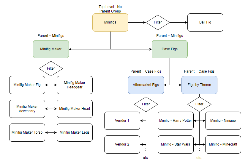
This article describes how to configure your Heartland Retail system to use Quick Item Buttons. These buttons allow users to quickly add items to tickets, without the need for scanning or searching. Here is a diagram indicating the flow:
Managing Button Groups
Button groups are top-level buttons, and appear on the first page when opening the Quick Item Buttons module. These groups do not have parent groups assigned.
Adding a Button Group
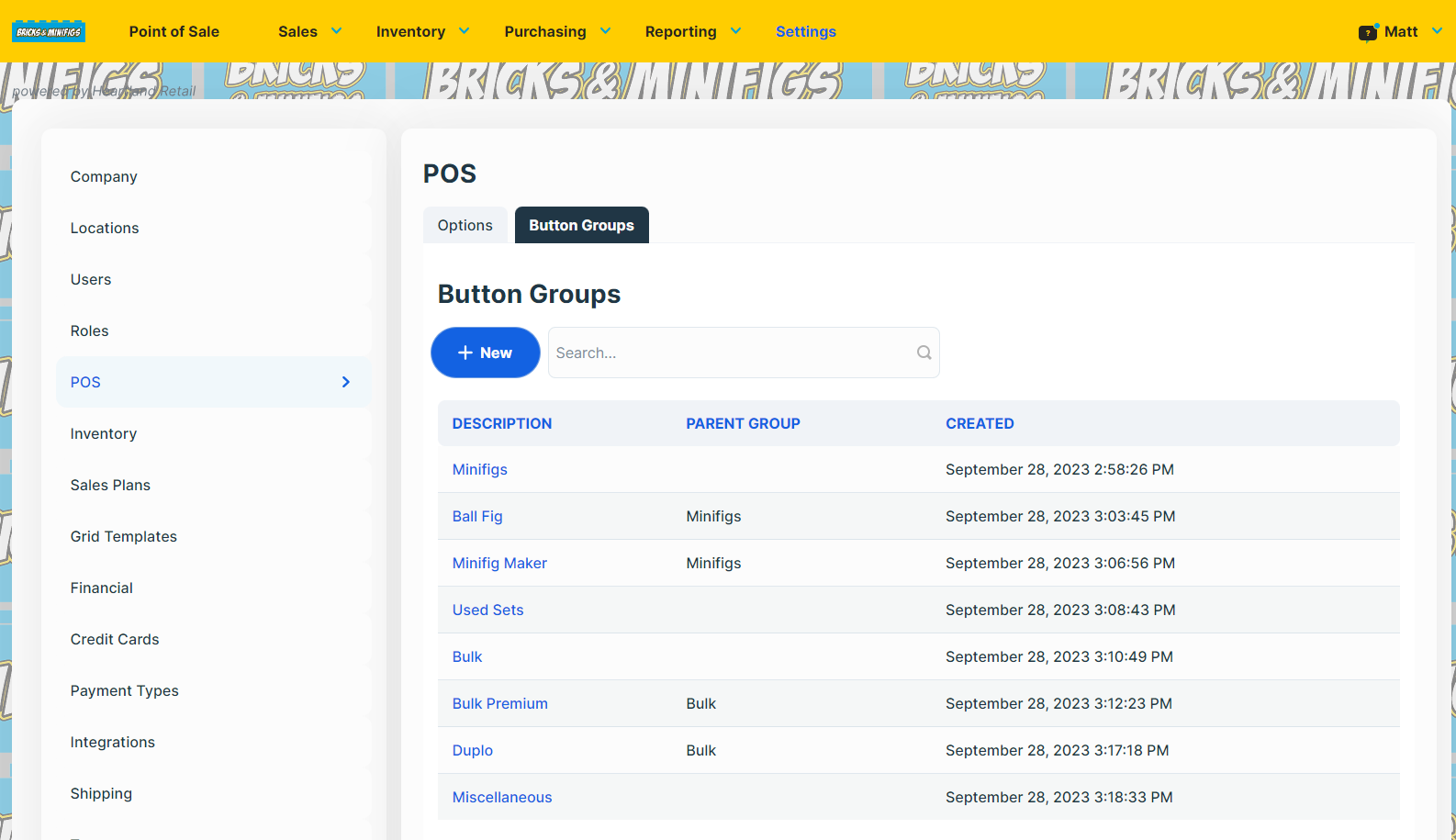
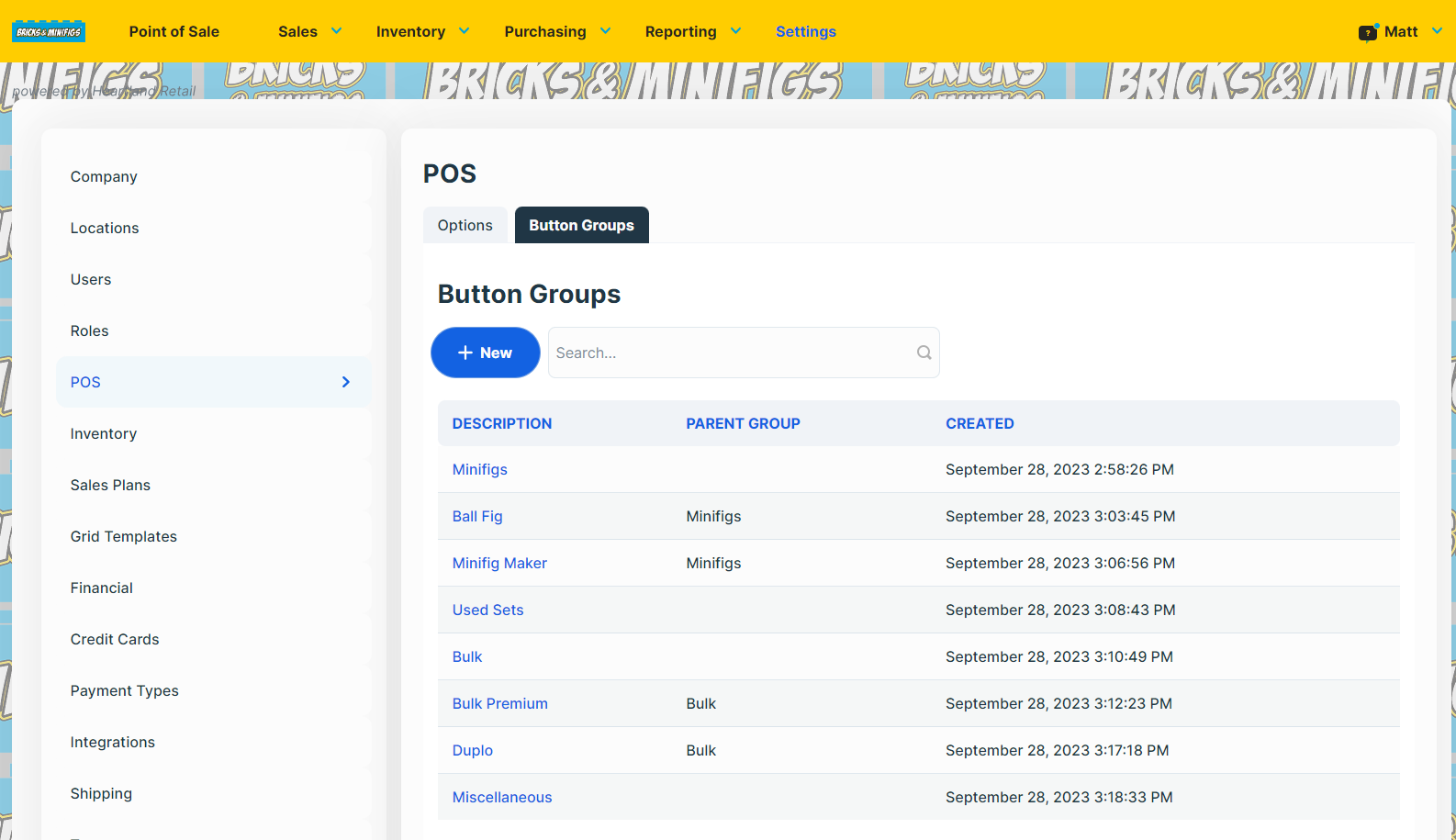
To create a new button group, go to Settings and select POS from the lefthand menu.
Select the Button Groups tab and tap +New.
Enter a name for the first level button group and leave the Parent Group set to None. The POS will display buttons for each button groups in the main Quick Buttons model. Click Create.
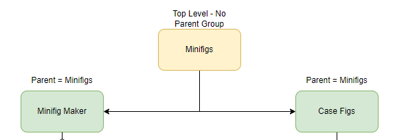
If you would like to organize item buttons more granularly, you can create additional groups and select a first level button group as the Parent Group. In the example below, Minifigs is the first-level (parent) button group, and Minifig Maker and Case Figs are subgroups.
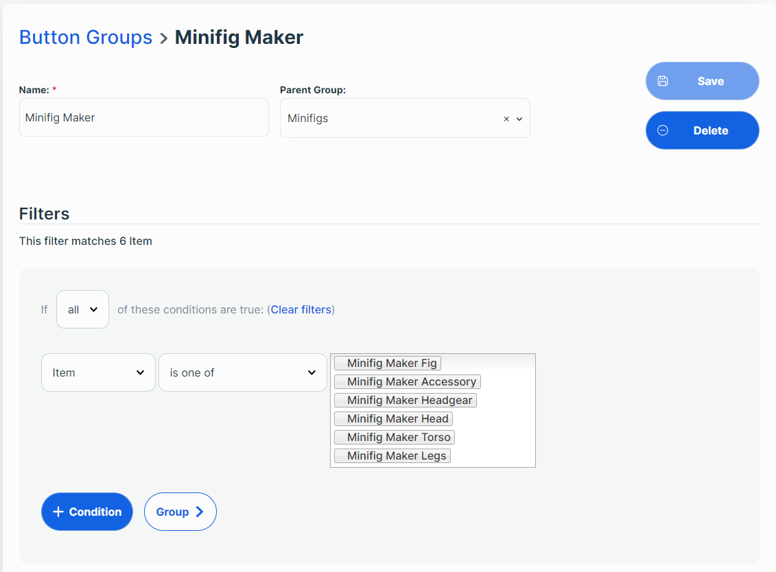
Add ‘child’ items using the Filter. The POS will display buttons for these items after the button group is selected from the Quick Buttons modal. Each child item must be assigned to a button group ‘parent’.
Please note:
** The filter rules here work just like those for Promotions and Coupons.
** The POS will display buttons for all child items of any given parent group when the user taps the parent group button.Select Save.
Searching Button Groups
To search for a button group, go to Settings and select POS from the lefthand menu.
Select the Button Groups tab, type desired search terms in the corresponding box, then tap the search icon.
Editing and Deleting Button Groups
To edit or delete a button group, go to Settings and select POS from the lefthand menu.
Select the Button Groups tab, type desired search terms in the corresponding box, then tap the search icon.
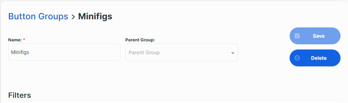
Select the button group you wish to edit or delete.
To edit, enter desired changes and select Save.
To delete, simply tap the Delete button and answer yes to the confirmation prompt.
Using Quick Item Buttons in POS
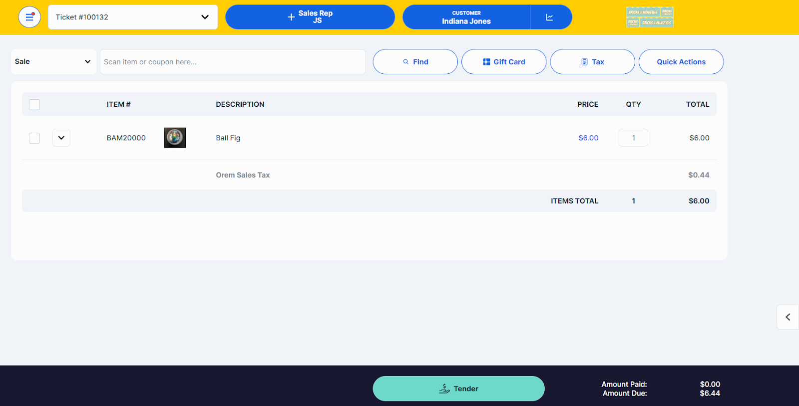
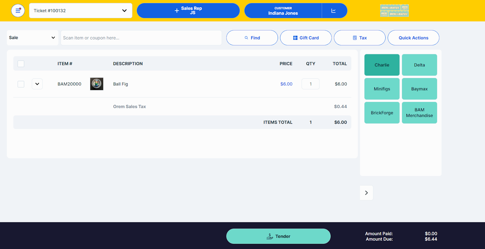
To access quick buttons, tap the left-pointing arrow in the bottom right corner.
Quick buttons are organized under group headings (such as Blue Things, Lilly Pulitzer Items, Large Items, etc., in the example below) and can be added/removed as needed, as previously described in Managing Button Groups.
Once a user taps a Quick Button, the POS will display a modal with a selection of defined items or, if in use, subcategories.
Tap buttons to add items as desired.
- To navigate back to a higher button group you can click on the … / to navigate one button up. To navigate to the main button page you will click on the Q1 /
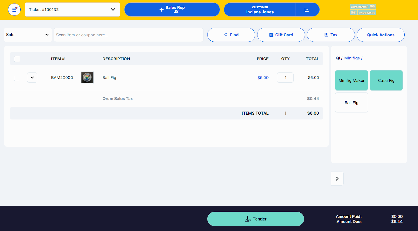
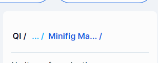
As long as the Quick Buttons modal is open, the POS will display the navigation path (for example, Minifigs / Case Figs…) at the top of the modal so users can easily see how they got to the current screen.
To exit Quick Buttons, tap the right-pointing arrow to the left of the Quick Buttons menu.